Written by Pacha - May 7, 2024
ETH Kipu - The Story Behind an Identity
A journey of identity, community and transformation through Ethereum's values.
Este asunto está ahora y para siempre en tus manos, nene.
This journey began when I volunteered to design at the first ETH Latam event in Buenos Aires back in 2022. Then came ETH Latam Bogotá and, almost without a break, Devcon. From that moment on, everything moved at lightning speed. In that whirlwind of work and new opportunities, the idea of what we later called ETH Kipu was born. Although I had already known many of the people with whom I share this path for several years, I felt a huge responsibility in my hands. It pushed me to grow professionally, knowing that I was being called upon for something that came from something as big as ETH Latam. The bar was set high, and from there, everything was going to be even bigger.
I fully understood that what we were about to create wasn't just another project. It was something that was going to impact many people, with a mission focused on education and driven by the principles of public goods, open source, and free access for everyone. These ideals deeply motivated me because they reflect what I value and who I am. I was born in the '90s in Argentina, in a working-class family, with a mother who was a teacher. I studied at a public university, although I didn't finish my degree. My professional life has been marked by economic instability, inflation, and absurd tax policies, as has happened to many others in our country.
Discovering tools and skills that allowed me to thrive in this industry was a radical change for me. My life improved, and so did my family's. Now, I want that same transformation I experienced to reach as many people as possible.
P.S.: Yes, the intro is from Los Redondos. And yes, there are many more songs that have accompanied me through each of the key moments of this journey.
Identity: No soy un extraño
From the beginning, I was clear that I wanted ETH Kipu's identity to foster a deep connection between people. We live in an increasingly hostile world, and in Latin America, in particular, the reality isn't easy. The countries we live in aren't the most peaceful nor the ones with the greatest economic stability. So, what I wanted to achieve with ETH Kipu's identity was that we would be perceived as someone close, someone to trust.
Our identity is based on altruism, thinking not only about ourselves but also about those who will come after us. One of our great achievements has been bringing our vision and the values of Ethereum to the next generation. To those young people who are still in school, with the intention of providing them with tools, knowledge, and values that will allow them to build new realities. While our project is based on blockchain technology, our true focus is on educating people so that technology becomes a tool that creates a positive impact on their lives.
I wanted our identity to speak of empathy, of considering the other's context, of building something together that lasts. Technology is just a means; what really matters is the impact it has on people.
Colors: Color humano
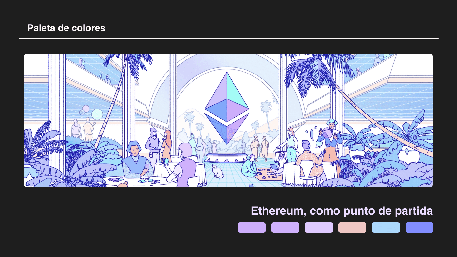
When the time came to define the color palette for ETH Kipu, I sought a connection both with Ethereum and with the essence of our land. I started with the palette used in the main illustration of ethereum.org, which gives us a vision of how this "infinite garden" so often talked about in the community should look.
From there, I began looking for colors that evoked the landscapes, foods, and traditional textiles of Latin America. The earth tones, the deep greens of the jungles, the vibrant reds and yellows of our fruits and flowers, the purples of Peruvian potatoes and corn… Every color I chose has a meaning: the ochre of arid lands, the green of our jungles, the bright colors of our traditions.

The Logo: Ser humano junto a los míos
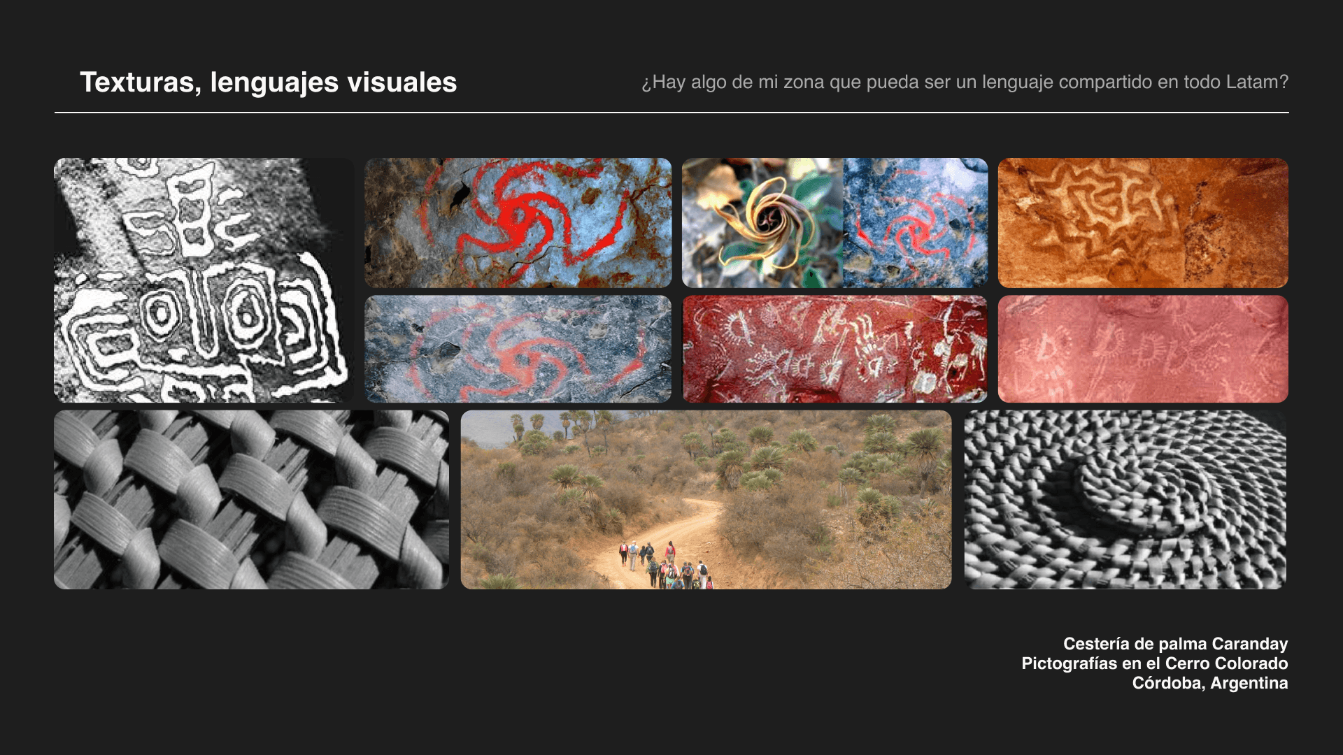
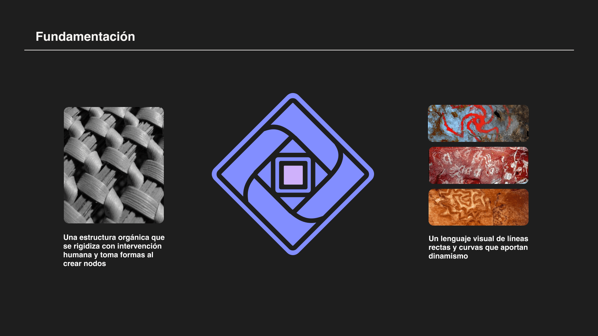
The intention with the logo has always been for people in Latin America to feel represented. I wanted all of us to share a common visual language. In this search, I was inspired by the art of caranday palm weaving, a traditional craft from northern Córdoba. This weaving, which becomes rigid as nodes are created, perfectly symbolizes what we want to build at ETH Kipu: an organic structure that, when intervened, becomes something solid and lasting.
Additionally, the rock paintings of Cerro Colorado provided another visual foundation: a language of straight and curved lines representing dynamism and connection, a clear reference to the first attempts at human communication that transcend the present.


This journey has been shared with incredible people, and I will always be grateful for the trust they placed in me to carry out this task. ETH Kipu isn't just a project; it's a fundamental part of the transformation I want to see in the world, and I feel honored to be a part of it.
Loco Pacha
Would you like to receive updates by email?
You will receive all our news and updates in your inbox. You can unsubscribe whenever you want :)
